السلام عليكم ورحمة الله وبركاته:
هذا الدرس عن CSS3 و في هذا الدرس سوف نتطرق ما هو الجديد في هذه التقنيه مع المتصفحات الجديدة:
رايحين نعمل خمس تقنيات جديدة:
1. Border Radii
2. Box Shadows
3. Text Shadows
4. Gradients
5. Multiple Backgrounds
الآن سنبدأ بالرقم واحد:
حتى نعمل خط ((برواز )) تكون فيه الزوايا قوسية و يتم دعمه من هذه المتصفحات:
Safari: 3.2+
Firefox: 3.0+
Chrome: 3.0+
Opera: 10.5+
Internet Explorer: 9.0+
الكود:
  -webkit-border-radius: size;
    -moz-border-radius: size;
    border-radius: size;
مثال :
<!DOCTYPE html PUBLIC "-//W3C//DTD XHTML 1.0 Transitional//EN" "http://www.w3.org/TR/xhtml1/DTD/xhtml1-transitional.dtd">
<html xmlns="http://www.w3.org/1999/xhtml">
<head>
<meta http-equiv="Content-Type" content="text/html; charset=UTF-8" />
<title>Untitled Document</title>
</head>
<style>
	.bodrer{
		width:50px;
		height:50px;
		border:#666 solid 1px;
		-webkit-border-radius: 5px;
		-moz-border-radius: 5px;
		border-radius: 5px;
	}

</style>
<body>
	<div class="bodrer">
	</div>
</body>
</html>
سيكون الشكل على النحو التالي:

****************** الدرس الثاني *****************
هو عمل ظل لشكل معين مثال : مربع مستطيل إلخ....
هذه الخاصية مدعومة من قبل هذه المتصفحات:
Safari: 3.2+
Firefox: 3.5+
Chrome: 3.0+
Opera: 10.5+
Internet Explorer: 9.0+
هذا الكود يستخدم بالتحليل التالي:
  -webkit-box-shadow: offset_x offset_y blur_radius color;
    -moz-box-shadow: offset_x offset_y blur_radius color;
    box-shadow: offset_x offset_y blur_radius color;
الكود بعد التطبيق:
 -webkit-box-shadow: 5px 5px 10px #555;
 -moz-box-shadow: 5px 5px 10px #555;
 box-shadow: 5px 5px 10px #555;
لنرى التطبيق كيف يمكن أن نراه على المتصفح:
<!DOCTYPE html PUBLIC "-//W3C//DTD XHTML 1.0 Transitional//EN" "http://www.w3.org/TR/xhtml1/DTD/xhtml1-transitional.dtd">
<html xmlns="http://www.w3.org/1999/xhtml">
<head>
<meta http-equiv="Content-Type" content="text/html; charset=UTF-8" />
<title>Untitled Document</title>
</head>
<style>
	.bodrer{
		width:50px;
		height:50px;
		border:#666 solid 1px;
		/* RADIUS CORNER    */
		-webkit-border-radius: 5px;
		-moz-border-radius: 5px;
		border-radius: 5px;

		/*    SHADOW BOX         */
		 -webkit-box-shadow: 5px 5px 10px #555;
		 -moz-box-shadow: 5px 5px 10px #555;
		 box-shadow: 5px 5px 10px #555;


	}

</style>
<body>
	<div class="bodrer">
	</div>
</body>
</html>
الصورة النهائيه:

وهناك خاصية لجعل هذا الظل بالداخل كالتالي:
الكود:
   -webkit-box-shadow: 0 0 20px #333 inset;
    -moz-box-shadow: 0 0 20px #333 inset;
   box-shadow: 0 0 20px #333 inset;
المقصود بالإنسيت هي وضع هذا الظل بالداخل:
لنجرب ما سيحدث:
الكود:
<!DOCTYPE html PUBLIC "-//W3C//DTD XHTML 1.0 Transitional//EN" "http://www.w3.org/TR/xhtml1/DTD/xhtml1-transitional.dtd">
<html xmlns="http://www.w3.org/1999/xhtml">
<head>
<meta http-equiv="Content-Type" content="text/html; charset=UTF-8" />
<title>Untitled Document</title>
</head>
<style>
	.bodrer{
		width:50px;
		height:50px;
		border:#666 solid 1px;
		/* RADIUS CORNER    */
		-webkit-border-radius: 5px;
		-moz-border-radius: 5px;
		border-radius: 5px;

		/*    INSET SHADOW BOX         */
   -webkit-box-shadow: 0 0 20px #333 inset;
    -moz-box-shadow: 0 0 20px #333 inset;
   box-shadow: 0 0 20px #333 inset;

	}

</style>
<body>
	<div class="bodrer">
	</div>
</body>
</html>
النتيجة:

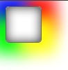
طيب الآن ماذا لو قلنا نريد أن يكون الظل ملون !!! هل يمكننا ذلك؟ نعم هذه هذ الطريقة:
الكود:
<!DOCTYPE html PUBLIC "-//W3C//DTD XHTML 1.0 Transitional//EN" "http://www.w3.org/TR/xhtml1/DTD/xhtml1-transitional.dtd">
<html xmlns="http://www.w3.org/1999/xhtml">
<head>
<meta http-equiv="Content-Type" content="text/html; charset=UTF-8" />
<title>Untitled Document</title>
</head>
<style>
	.bodrer{
		width:50px;
		height:50px;
		border:#666 solid 1px;
		/* RADIUS CORNER    */
		-webkit-border-radius: 5px;
		-moz-border-radius: 5px;
		border-radius: 5px;

		/*    COLOR SHADOW BOX         */
    -webkit-box-shadow: 0 0 20px #333 inset,
                        20px 15px 30px yellow,
                        -20px 15px 30px lime,
                        -20px -15px 30px blue,
                        20px -15px 30px red;

    -moz-box-shadow: 0 0 20px #333 inset,
                     20px 15px 30px yellow,
                     -20px 15px 30px lime,
                    -20px -15px 30px blue,
                    20px -15px 30px red;

   box-shadow: 0 0 20px #333 inset,
               20px 15px 30px yellow,
               -20px 15px 30px lime,
               -20px -15px 30px blue,
               20px -15px 30px red;

  }

</style>
<body>
	<div class="bodrer">
	</div>
</body>
</html>
النتيجة:
****************** الدرس الثالث ظل للكلمات *****************
الظل للكلمات تدعمها المتصفحات التالية:
Safari: 3.2+
Firefox: 3.5+
Chrome: 3.0+
Opera: 10.1+
Internet Explorer:للأسف نتمنى أن تدعم قريباً!
الكود يتم تحليله على هذا النمط:
text-shadow: offset_x offset_y blur_radius color;
و لكن بعد التطبيق يكون كالتالي:
هنا يكون فقط للون الكلمة ; color: #fff
وهنا الخصائص للظل text-shadow: 0 0 3px #333;
بعد التطبيق يتم ظهو التالي :
الكود:
<!DOCTYPE html PUBLIC "-//W3C//DTD XHTML 1.0 Transitional//EN" "http://www.w3.org/TR/xhtml1/DTD/xhtml1-transitional.dtd">
<html xmlns="http://www.w3.org/1999/xhtml">
<head>
<meta http-equiv="Content-Type" content="text/html; charset=UTF-8" />
<title>Untitled Document</title>
</head>
<style>
	.text_shadow{
		text-shadow: 0 0 3px #333;
		 color: #fff;
		 font:bold 16px Tahoma, Geneva, sans-serif;
		 direction:ltr;
		 text-align:left;
	 }

</style>
<body>
	<div class="text_shadow">
    	www.arabteam2000.com
	</div>
</body>
</html>
الصورة:

الآن أريد أن أجعل هذه الكلمة تشتعل ناراً على سبيل المثال:
نضع الكود التالي:
<!DOCTYPE html PUBLIC "-//W3C//DTD XHTML 1.0 Transitional//EN" "http://www.w3.org/TR/xhtml1/DTD/xhtml1-transitional.dtd">
<html xmlns="http://www.w3.org/1999/xhtml">
<head>
<meta http-equiv="Content-Type" content="text/html; charset=UTF-8" />
<title>Untitled Document</title>
</head>
<style>

	.text_shadow{

	 text-shadow: 0 0 2px #ccc,
				 0 -2px 2px #ff3,
				 2px -5px 3px #fd3,
				 -2px -7px 6px #f80,
				 2px -9px 9px #f20;
				 color:red;

		 font:bold 16px Tahoma, Geneva, sans-serif;
		 direction:ltr;
		 text-align:left;
	 }

</style>
<body>
	<div class="text_shadow">
    	www.arabteam2000.com
	</div>
</body>
</html>
فتكون النتيجه كالتالي:

****************** الدرس الرابع تدرج الألوان *****************
هذه الخاصية لتدرج الألوان تدعم من هذه المتصفحات فقط:
    Safari: 4+
     Firefox: 3.6+
     Chrome: 5+
     Opera: أتمنى بقدوم هذه التقنية قريباً! للأسف غير مدعومة من هذا المتصفح
    Internet Explorer: أتمنى بقدوم هذه التقنية قريباً! للأسف غير مدعومة من هذا المتصفح
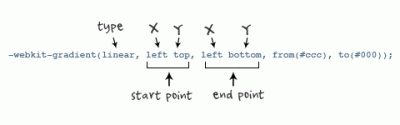
تحليل الستايل كالتالي - للويب كت:
-webkit-gradient(<type>, <point> [, <radius>]?, <point> [, <radius>]? [, <stop>]*)

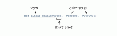
أما للفيرفوكس:
-moz-linear-gradient(top, #ccc, #000);
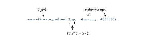
الأرقام في هذا الكود وضعتها عشوائية فقط للتوضيح:
<!DOCTYPE html PUBLIC "-//W3C//DTD XHTML 1.0 Transitional//EN" "http://www.w3.org/TR/xhtml1/DTD/xhtml1-transitional.dtd">
<html xmlns="http://www.w3.org/1999/xhtml">
<head>
<meta http-equiv="Content-Type" content="text/html; charset=UTF-8" />
<title>Untitled Document</title>
</head>
<style>
	.gradient{
		width:50px;
		height:50px;
   		background:-webkit-gradient(linear, 20% 15%, 100%  50%, from(red), to(white));
  		background:-moz-linear-gradient(red, white);
		 }

</style>

<body>
	<div class="gradient">

	</div>
</body>
</html>
فيكون الشكل التالي:

و هذا الكود أيضاً لعمل التدرج بشكل دائري :
   1. -webkit-gradient(radial, center center, 0, center center, 50, from(white), to(red));
   2. -moz-radial-gradient(white, red)
فيصبح الشكل كالتالي:

*************** الدرس الخامس تعدد الخلفيات (( بأن تكون طبقات فوق بعضها )) **********************
في الستايل سوف نرى كيفية عمل أكثر من خلفية في الصفحة نبدأ بالدعم:
هذه الميزة تدعمها المتصفحات التالية:
Safari: 3.2+
Firefox: 3.6+
Chrome: 3.0+
Opera: 10.5+
Internet Explorer: 9.0+
الستايل بهذا الشكل :
   background: url(Name of the image but used png file.), -webkit-gradient(linear, left top, left bottombottom, from(#999), to(#333));
background: url(Name of the image but used png file.), -moz-linear-gradient(#999, #333);
و سيكون الكود بهذ الشكل:
<!DOCTYPE html PUBLIC "-//W3C//DTD XHTML 1.0 Transitional//EN" "http://www.w3.org/TR/xhtml1/DTD/xhtml1-transitional.dtd">
<html xmlns="http://www.w3.org/1999/xhtml">
<head>
<meta http-equiv="Content-Type" content="text/html; charset=UTF-8" />
<title>Untitled Document</title>
</head>
<style>
	.multiple{
		width:100px;
		height:100px;
   		background: url(noise.png), -webkit-gradient(linear, left top, left bottombottom, from(#999), to(#333));
   		background: url(noise.png), -moz-linear-gradient(#999, #333);
		}

</style>

<body>
	<div class="multiple">

	</div>
</body>
</html>
و الشكل سيكون على النحو التالي:

الآن فوق كل هذا هل يمكنني أيضاً أن أضع زر فوق تدرج اللون؟ والخلفيات المتعددة؟
نعم يمكنك ذلك لاحظ كيف خطوة بخطوة:
أولاً ننشأ ديف و بداخله دف آخر على النحو التالي:
<div class="panel">
  <div class="button">Button</div>
</div>
الآن بعدما تم إنشائهم يجب عليك إعطائم الستايل كالتالي:
من أجل الديف الأول نضع هذا الستايل:
   .panel {
  background: -webkit-gradient(linear, left top, left bottombottom, from(#bbbcbb), to(#959695));
 background: -moz-linear-gradient(#bbbcbb, #959695);
  background-color: #b7b9b7;
   width: 100px;
   }
وهذا للكبسة أو الزر الي بالداخل:
   .button {
     display: inline-block;
     margin: 20px;

       padding: 3px 6px;
     font-family: 'Lucida Grande', Arial, sans-serif;
      font-size: 13px;

        -webkit-border-radius: 3px;
     -moz-border-radius: 3px;
    border-radius: 3px;

    border: 1px solid rgba(0, 0, 0, 0.6);

background: -webkit-gradient(linear, left top, left bottombottom, from(#fbfcfb), to(#9d9e9d));
   background: -moz-linear-gradient(#fbfcfb, #9d9e9d);
  background-color: #c0c2c0;

    text-shadow: rgba(255, 255, 255, 0.4) 0px 1px;

    -webkit-box-shadow: rgba(255, 255, 255, 0.4) 0 1px;
    -moz-box-shadow: rgba(255, 255, 255, 0.4) 0 1px;
  box-shadow: rgba(255, 255, 255, 0.4) 0 1px;

      -webkit-user-select: none;
     -moz-user-select: none;
    cursor: default;
 }
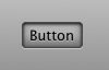
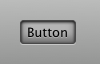
فيصبح الشكل كالتالي :

و عندما يكون الزر مفعل سيكون له هذا الستايل:
 .button:active {
    background: #B5B5B5;
     -webkit-box-shadow: rgba(255, 255, 255, 0.4) 0 1px,
                       black 0px 1px 3px inset,
                          rgba(0, 0, 0, 0.4) 0px -5px 12px inset;

     -moz-box-shadow: rgba(255, 255, 255, 0.4) 0 1px,
                     black 0px 1px 3px inset,
                    rgba(0, 0, 0, 0.4) 0px -5px 12px inset;

    box-shadow: rgba(255, 255, 255, 0.4) 0 1px,
               black 0px 1px 3px inset,
                rgba(0, 0, 0, 0.4) 0px -5px 12px inset;

    text-shadow: rgba(255, 255, 255, 0.3) 0px 1px;
  }
جميع ما بالستايل سبق و شرحناه في الدروس السابقة و الدرس الي قبل هذا.
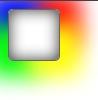
الآن سيصبح أمامنا الشكل التالي:
أسأل الله أن أكون قد أفدتكم و إدعوا لي بالتوفيق.
و السلام عليكم ورحمة الله وبركاته